
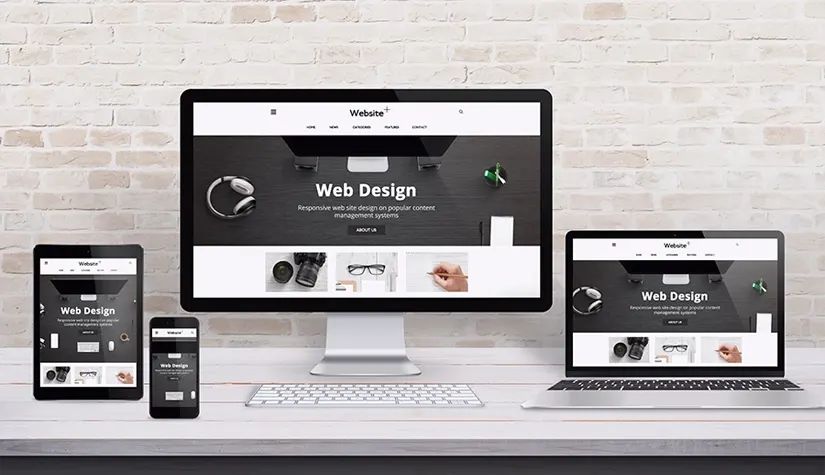
How Responsive Website Design Boosts SEO Performance
If your website still looks like a pixelated mess on someone’s phone. In that case, you’re basically waving goodbye to users before they even read your headline. Whenever you want to know how responsive website design boosts SEO performance, these days. Google is all about rewarding sites that actually work on any screen. Laptop, phone, whatever—your site better adjust or it’s getting ghosted in terms of people and algorithms.
Nobody has time to pinch and zoom their way through tiny menu buttons or squint at microscopic fonts. Responsive design isn’t just for show; it actually keeps people sticking around. When people hang out longer and click around, Google notices. That is SEO gold, which you should have.
Whenever it comes to how responsive design helps SEO, there is no need to mess with two separate sites, one for desktop, one for mobile. When you can just have one that does it all with less hassle, fewer headaches, and you don’t have to worry about the whole duplicate content. If your site is not responsive, you need to get better SEO strategies.
Impact Of Mobile-Friendly Design On SEO
Nowadays, everybody’s glued to their phone. Whenever you just look around on the bus or at a coffee shop. That’s why there is no need to get surprised by the impact of mobile-friendly design on SEO. Over half the web traffic now comes straight from smartphones or tablets. Google caught on and flipped the script with this whole mobile-first indexing thing, so now they judge your site by its mobile version first. If your website is stuck in 2012 and doesn’t play nice with phones, then your SEO is messed up.
Do you need fast-loading pages and non-negotiable? People have zero patience for slow sites, and there are many SEO benefits of responsive websites. If your stuff drags, visitors bail in a heartbeat, and the bounce rate goes through the roof. Responsive design is the move here. Everything, such as images, text, and buttons, needs to snap into place no matter the screen size, and it better not slow things down. Sites that look sharp and work smoothly on mobile will have a higher chance of more clicks and just look perfect, which makes both users and Google give a thumbs up.
Responsive Website Seo Advantages
There are huge responsive website SEO advantages; it is not just about making your site look cute on someone’s phone. First off, having one URL for every device is a game-changer. No more messing with different links for mobile and desktop. Google loves that; it just makes life easier for everyone. All your backlinks point to the same spot, so you’re stacking up that sweet link instead of scattering it all over the internet.
Why Responsive Web Design is Important for SEO?
You can skip duplicate content. If you’re running two separate versions of your site, it is super easy to mess up and end up with the same thing in two places. Google doesn’t love to support this. A single and responsive setup with problem-solving strategies is perfect, as there will be no more accidental copy-paste penalties.
There is no need to even get me started on user experience. People bounce fast if your site is a mess on their screen. But when things work smoothly, there is no pinching and no extra zooming; users stick around longer and click more. Search engines notice all these activities and help stalkers for good engagement.
Making your site accessible isn’t just a nice thing to do. It actually helps your Seo, too. More people can use your site, so more people stay on your site, which will be a win-win situation for your site. Responsive design is a no-brainer if you want to be friends with Google with the help of the best strategies.
Responsive Web Design for Better Google Rankings
Google is basically obsessed with user experience these days. If your site looks like a mess on someone’s phone, then this can never be ideal. Responsive web design for better google rankings, not just a trendy buzzword.
You know all those cryptic terms like core web vitals, which turn out they be just Google’s way of making webmasters. Lap, fid, CLS are fancy ways of saying, “does your site load fast, can people actually use it, and does the page stop jumping around like a caffeinated squirrel. If your site is responsive, you have already got a strong game. Images, buttons, and icons need to play nice with any screen, whether it’s a 6-inch phone or a huge monitor.
Does mobile responsiveness improve SEO?
Google straight-up favors sites that look good on mobile. Not only do you get more views, but you also pull in visitors who actually stick around and maybe even buy something instead of rage-quitting five seconds in. If you actually want to boost SEO with mobile-friendly web design, start with a responsive setup, so your site doesn’t look like a dumpster fire on a tiny screen. Shrink those images so they load fast and make the buttons big enough for my thumbs, and, please, don’t make the size that needs to squint or pinch-zoom just to read a headline.
Conclusion
Don’t just set it and forget it. Run your site through Google’s mobile-friendly test. If you spot any lag or something’s busted, fix it through responsive design and lower bounce rates SEO. From the user’s side, you want everything smooth—easy menus, buttons that make sense, and clear calls-to-action. Basically, don’t make people work to use your site, or they’ll bail faster.
Putting effort into a mobile-friendly site is not just about keeping up with the times. It actually makes people trust you more, and Google takes notice. Your sites should easily be browsed on an old phone without having to scroll, which will strengthen your SEO game.
Related Posts
The Role of Voice Search in Modern SEO
30-Dec-25